Insights
Product Page Design That Converts in 2026

A high-converting product page answers the buyer’s top questions at a glance and makes purchasing frictionless. That means a clear image gallery, an honest price, working variant selectors, a CTA that never disappears, and trust markers close enough to the buy button to matter.
The bar is lower than most teams assume. Baymard Institute found the average ecommerce product page carries 24 structural usability issues, and only about 18% of sites reach an acceptable standard. Fixing even a handful of those issues puts you ahead of most competitors.
Here’s what belongs on every product page, no matter the platform:
- A media gallery with at least one lifestyle or in-use shot, not just studio photos
- A price that’s visible without scrolling, with any discount logic spelled out
- Variant selectors that update images and disable out-of-stock combinations
- A CTA that stays visible as the shopper scrolls (sticky on mobile especially)
- Star rating and review count near the buy panel
- Shipping cost and estimated delivery window before checkout, since 64% of shoppers look for this on the product page itself, per Baymard
Pro Tip: Don’t guess which fix matters most. Run single-KPI tests, one primary metric like conversion rate, with average order value and return rate as guardrails, so a “win” on one number doesn’t quietly hurt another.
Key Takeaways
A high-converting product page puts decision-critical information above the fold, backs it with fast load times, and gets validated through single-KPI testing rather than instinct.
| Point | Details |
|---|---|
| Fix structural issues first | Address variant sync and shipping visibility before any visual redesign, since these drive most usability failures. |
| Prioritize the Answer Stack | Keep gallery, price, variants, and CTA above the fold on both desktop and mobile. |
| Add scale and video to galleries | A scale-reference image and a short gallery video can lift mobile add-to-cart rates by 12% to 18%. |
| Hit the mobile speed target | Aim for Largest Contentful Paint under 2.5 seconds on a mid-range 4G device. |
| Test one KPI at a time | Use conversion rate or add-to-cart rate as the primary metric, with AOV and return rate as guardrails. |
| Build it right from the start | Quantum3 designs product and landing pages with the Answer Stack, performance budgets, and analytics built in from launch. |
Table of Contents
- What Is the Anatomy of a Modern Product Page?
- How Should Product Photography and Video Be Ordered?
- What Makes Product Copy Actually Convert?
- How Do You Show Trust Signals Without Cluttering the Page?
- What CTA and Checkout Patterns Remove Friction?
- Does Mobile Performance Really Affect Product Page Conversion?
- How Much Personalization Belongs on a Product Page?
- How Do You Test and Measure Product Page Changes?
- How Do You Apply This on Shopify, WooCommerce, or BigCommerce?
- What Do the Benchmarks Actually Tell You?
- What We’ve Learned Building Product Pages That Convert
- How Quantum3 Helps You Build a Product Page That Converts
- Frequently Asked Questions
- Sources
What Is the Anatomy of a Modern Product Page?
A product page succeeds or fails based on what’s visible in the first screen. Everything else is support material.
Structure your page into distinct zones, and treat each one as a job to be done rather than a design flourish. Online Store News describes the 2026 standard as gallery plus buy panel above the fold, trust signals visible immediately, then details, user-generated content, and reviews stacked below. Think of it as an Answer Stack: the page answers questions in the order shoppers actually ask them.
The core zones look like this:
- Media gallery: photos and short video, ordered by decision priority
- Buy panel: title, price, variant selectors, CTA, and shipping snippet
- Trust and fulfillment strip: rating, review count, return policy, delivery estimate
- Details section: specs, materials, sizing, care instructions
- Reviews and UGC: filterable feedback and real customer photos
- Q&A and recommendations: objection handling and cross-sell, always last
On desktop, the buy panel typically sits beside a large gallery in a two-column split. On mobile, that same information stacks vertically, gallery first, with a sticky CTA bar pinned to the bottom of the screen once the shopper scrolls past the initial buy panel. If you sketched this anatomy as a wireframe, it would look like a funnel narrowing toward one button, everything above it exists to make pressing that button feel safe.
How Should Product Photography and Video Be Ordered?
Shoppers decide with their eyes first and their reading second. NN/g’s research on product pages found that shoppers rely on images far more than long descriptions to confirm details like fit, texture, or included components.
That means shot order isn’t a creative choice, it’s a conversion sequence. Build your gallery in this order:
- Hero shot: clean, well-lit, product-only, sets first impression
- Detail shots: close-ups of stitching, hardware, texture, or material
- In-use or lifestyle shot: shows the product solving a real problem
- Scale reference: product next to a common object or on a body
- 360-degree view or short video: rotation or a 10 to 15 second demo clip
That scale shot isn’t optional decoration. Baymard’s research found many product pages skip proper scale references entirely, leaving shoppers to guess dimensions from a photo alone, and that guesswork is a direct driver of returns when the product arrives smaller or larger than expected.
Video earns its spot in the gallery, too. Merchant data reported by Online Store News shows adding a short video to the primary gallery can lift mobile add-to-cart rates by roughly 12% to 18%. You don’t need a production studio to see that lift. A phone-shot 360 spin or a 15-second demo, framed vertically for mobile and compressed to load fast, often outperforms a polished but slow-loading video.
On specs: keep hero images around 2000 pixels on the long edge, compress aggressively (WebP where supported), and cap video length under 20 seconds unless it’s a deep how-to piece housed further down the page.
Pro Tip: Shoot once, use everywhere. A single product video shoot can supply your gallery clip, a social ad, and an email hero image, cutting production cost per asset by reusing the same footage across channels. Quantum3’s video production guidance covers how to plan a shoot that serves multiple channels from one session.
What Makes Product Copy Actually Convert?
Lead with the outcome, not the specification. A shopper deciding between two similar products wants to know what changes for them, not what the product technically contains, at least not yet.
Your headline and first sentence should state the benefit plainly: what problem this solves or what result it delivers. Follow immediately with the objections that stop purchases, fit uncertainty, durability doubts, compatibility questions, inside the first scroll or two. Waiting until paragraph five to address “does this run small?” costs you the sale before the shopper gets there.
Format for scanning, because almost nobody reads product copy top to bottom:
- Short paragraphs, two to three sentences at most
- Bullets for specs and dimensions, never buried in prose
- Bold key claims (materials, guarantees, certifications) so they catch a scanning eye
- Inline sizing or fit guidance placed right next to the variant selector, not in a separate tab
Microcopy deserves the same care as headline copy. Variant labels should describe the actual difference (“Charcoal, water-resistant” beats “Option A”). And your add-to-cart confirmation should tell the shopper what just happened, “Added to cart, 2 items”, rather than a silent icon change that leaves them wondering if it worked.
On SEO: implement product schema markup so search engines can surface price, availability, and rating directly in results. Keep meta titles specific (product name plus one distinguishing detail) rather than generic category terms, and reserve longer, keyword-rich copy for a details section further down the page, where it supports long-tail search without cluttering the buy-focused copy up top. Quantum3’s marketing content guidance walks through applying this pattern to technical or B2B product pages, where objection-handling copy tends to run longer.
How Do You Show Trust Signals Without Cluttering the Page?
Trust signals work best in tiers, close enough to reduce doubt, far enough not to compete with the CTA for attention.
Right in the buy panel, keep it minimal: a star rating and review count, nothing more. That single line does the job of reassuring a shopper without pulling their eyes away from the price and the button. One step below the buy panel, a pull-quote from a strong review can reinforce a specific selling point, fit, durability, ease of use, in the shopper’s own words.
Further down, a UGC gallery of real customer photos earns its place, and a full review section with filters (by rating, by verified purchase, by topic like “fit” or “quality”) lets shoppers self-serve the exact reassurance they need. A verified-purchase badge on reviews matters more than most brands realize; it tells shoppers the feedback isn’t fabricated.
Shipping and returns visibility belongs near the CTA, not buried in a footer link:
- Estimated delivery window, stated plainly (“Arrives by Friday” beats “3 to 5 business days”)
- Return window and whether return shipping is free
- Pickup or local availability options, if applicable
Trust badges themselves are a mixed bag. Payment security badges near checkout help; generic “as seen on” badges with no context tend to blend into noise. If you’re evaluating review and UGC tools, platforms in the ratings-and-reviews category (think review collection and syndication tools) and dedicated UGC gallery apps both serve this tiered approach well, just avoid stacking more than two or three trust elements in any single zone.
What CTA and Checkout Patterns Remove Friction?
The button itself carries more weight than most redesigns give it credit for. Get the mechanics wrong and you lose sales that had already decided to buy.

Start with Add to Cart versus Buy Now. Add to Cart suits multi-item shopping and lets buyers keep browsing; Buy Now suits single-item, high-intent purchases where skipping the cart page shortens the path to checkout. Many product pages benefit from offering both, with Buy Now as the secondary, lower-emphasis option. Whichever you use, make the CTA sticky on mobile so it survives scrolling, and change its state visibly after a tap, a brief “Added” confirmation with a cart icon update beats a silent, static button that leaves shoppers tapping twice out of doubt.
Variant selectors cause more abandoned carts than teams expect, mostly through avoidable errors. Follow these rules:
- Link product images to the selected variant, so choosing “Blue” actually shows blue
- Gray out or disable combinations that are out of stock, rather than letting shoppers select them and fail at checkout
- Preselect a variant when there’s a clear signal (most-purchased color, or a size from a previous session)
On mobile, native payment buttons deserve prime placement. Apple Pay and Google Pay let a shopper complete a purchase in two taps without typing a card number, and placing them directly in the sticky CTA area, not buried at checkout, captures buyers who’d otherwise abandon over a tedious form. Buy-now-pay-later options are worth surfacing near the price for higher-ticket items, and if you’re processing payments through Stripe, its native support for these one-click and BNPL methods make this a configuration task rather than a custom build.
The ideal flow moves cleanly through four states: selection-incomplete (CTA disabled or prompting a choice), ready-to-purchase (CTA active), adding (brief loading state), added (visible confirmation). Skipping any one of those states is where shoppers lose confidence in what just happened.
Does Mobile Performance Really Affect Product Page Conversion?
Yes, and the margin for error is thinner than on desktop. Mobile shoppers abandon slow pages faster, and they’re doing everything, browsing, comparing, deciding, on a smaller screen with less patience for friction.
A few mobile-specific rules matter more than general polish:
- Keep the add-to-cart button sticky and visible at all times, not just at the top of the page
- Make galleries swipeable with visible dots or thumbnails so shoppers know how many images remain
- Collapse long descriptions into expandable sections instead of forcing endless scrolling
- Surface native payment buttons (Apple Pay, Google Pay) above the fold in the buy panel, not after a scroll
Speed is not a secondary concern here, it’s foundational. Aim for a Largest Contentful Paint under 2.5 seconds on a mid-range Android device over a 4G connection. Test this with real devices where possible, not just emulation, using Google PageSpeed Insights and Lighthouse to catch what desktop testing misses.
Accessibility deserves equal priority, not a separate checklist tackled later. Add ARIA labels to gallery controls and variant selectors so screen readers can announce what’s selected. Ensure every interactive element, thumbnails, size buttons, the CTA itself, is reachable and operable by keyboard alone. Check CTA color contrast against WCAG guidelines; a beautiful button that fails contrast ratios is invisible to a meaningful share of shoppers.
If your engineering time is limited, prioritize in this order: CTA visibility and stickiness first, image and video compression second, variant-sync bugs third. Those three fixes tend to move conversion faster than any visual redesign, and Baymard’s usability research consistently finds variant desynchronization, wrong price or image showing for a selected option, undermining buyer confidence even on otherwise well-designed sites.
How Much Personalization Belongs on a Product Page?
Personalization on a product page should feel invisible, not like a second homepage bolted onto the buy flow. The safest, highest-return tactics are narrow by design.
Preselecting a variant based on a clear signal, browsing history, most-purchased option, works well because it saves a step without adding visual noise. A single cross-sell carousel, capped at four to six items, placed below the reviews section, lifts average order value without competing with the primary purchase decision. Behavioral recommendations belong in that same limited space; resist the urge to add a second or third recommendation block.
The mistake most teams make is treating the product page like a merchandising surface for the whole catalog. Every added carousel, banner, or “you might also like” block pulls attention away from the one decision that actually matters right now. Keep personalization scoped to data you can actually act on, purchase history, current cart contents, or browsing signals, and measure it the same way you’d measure any other change: as a single test against a clear baseline, not a permanent feature rollout.
A low-risk starting test: preselect the best-selling variant for new visitors and measure whether it changes conversion rate without moving return rate in the wrong direction.
How Do You Test and Measure Product Page Changes?
Test one thing at a time, and know before you launch which number decides success. Running five simultaneous changes tells you nothing about which one actually worked.
Shopify’s own guidance recommends a single primary KPI per experiment, usually conversion rate or add-to-cart rate, with average order value and return rate tracked as guardrails so a short-term win doesn’t create a longer-term problem. Aim for 95% statistical confidence before calling a result, and don’t stop a test early just because early numbers look promising; underpowered tests are the most common reason teams chase phantom wins.
| Experiment type | Primary metric | Guardrail metrics |
|---|---|---|
| CTA copy or color change | Add-to-cart rate | Conversion rate |
| Hero image or gallery order | Conversion rate | Return rate |
| Price or discount framing | Conversion rate | Average order value |
| Variant preselection | Conversion rate | Return rate |
| Shipping/returns visibility | Add-to-cart rate | Conversion rate |
Reading results takes judgment as much as math. A fast win on add-to-cart rate that quietly raises returns two weeks later isn’t a win, it’s a shifted problem. Give guardrail metrics time to surface before declaring victory, and treat instrumentation quality as part of the test, not an afterthought; Quantum3’s notes on server-side tracking cover why measurement accuracy often matters more than the design change itself.
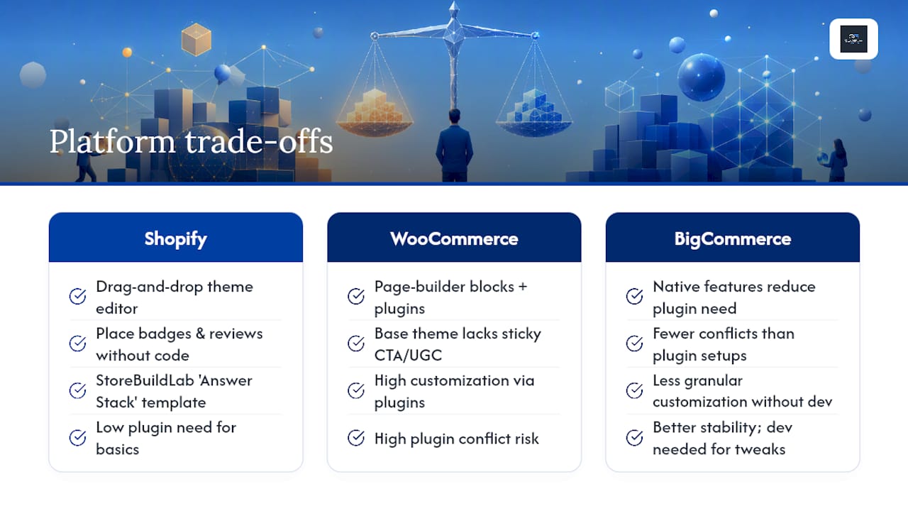
How Do You Apply This on Shopify, WooCommerce, or BigCommerce?
Each platform gets you to the Answer Stack differently, but the destination is the same.
On Shopify, most modern themes support drag-and-drop section reordering in the theme editor, letting you place trust badges, shipping info, and reviews without touching code. A structured section order, above-the-fold essentials, value props, specs, proof, FAQ, related products, as outlined by StoreBuildLab, gives you a template to copy rather than design from scratch. If you’re weighing Shopify against alternatives for a new build, Quantum3’s platform comparison breaks down where each one wins.
WooCommerce relies more heavily on page builder blocks and plugins, since the base theme rarely ships with a sticky mobile CTA or a UGC gallery out of the box. That flexibility is a double-edged sword, more control, but also more room for plugin conflicts that cause layout shift or slow load times.
BigCommerce leans toward native features requiring less plugin dependency, which tends to mean fewer conflicts but less granular customization without developer involvement.
Across all three, stick to category recommendations rather than picking blind: review and ratings apps, dedicated UGC gallery tools, and gallery or zoom apps each solve a specific piece of the Answer Stack. The most common platform pitfall is stacking too many apps that each inject their own scripts, causing layout shift and slow Largest Contentful Paint scores. When variant sync breaks, mismatched images or prices after a selection, it’s almost always an app conflict rather than a theme bug, so audit recently installed apps first before rebuilding anything.
For a broader look at where no-code tools help and where they run out of runway, Quantum3’s website builder comparison is worth a read before you commit to a platform.
What Do the Benchmarks Actually Tell You?
The research is consistent enough to build a roadmap around. Baymard’s audits found 82% of sites carry severe usability issues on product pages, and only 18% clear the bar for acceptable UX, meaning most of your competitors have not fixed the basics either.
Three numbers worth measuring your own page against:
- Usability issue rate: aim to eliminate the most common structural issues Baymard documents, starting with variant sync and missing shipping visibility
- Mobile LCP: under 2.5 seconds on a mid-range 4G device, tested with PageSpeed Insights
- Video lift: a 12% to 18% mobile add-to-cart lift is achievable from adding a short gallery video, per merchant data
These aren’t vanity metrics. They’re the difference between a page that quietly loses shoppers and one that earns the sale it already deserved.
What We’ve Learned Building Product Pages That Convert
The pattern that shows up again and again is that teams over-invest in visual polish and under-invest in the boring mechanics: variant sync, shipping visibility, load time on a mid-range phone over 4G. A gorgeous hero image on a page that takes four seconds to load loses to an ugly page that loads in one.
Our approach starts with an audit, not a redesign. We map where a page’s structure creates doubt or friction before touching a single pixel, then build a prioritized roadmap so the highest-impact fixes ship first. From there, focused tests replace guesswork: one change, one primary KPI, guardrails watched the whole time. Wins get scaled once they’re proven, not before.
Clients who fix CTA visibility, image load speed, and variant sync issues first, ahead of any visual redesign, tend to see the fastest movement in conversion rate, often within the first testing cycle. That order matters more than most teams expect walking in.
The gap between a mediocre product page and a strong one usually isn’t creative talent. It’s discipline: measuring one thing at a time, fixing the invisible mechanics before the visible ones, and resisting the urge to change five things because the page “feels” outdated.
How Quantum3 Helps You Build a Product Page That Converts
Fixing a product page in isolation only gets you so far if the page itself was never built with conversion mechanics in mind. Quantum3 designs and builds product and landing pages from the ground up around the Answer Stack, sticky mobile CTAs, performance budgets, and analytics baked in from day one, so you’re not retrofitting fixes onto a page that was never structured to convert.

That means you get a page engineered for a fast Largest Contentful Paint, working variant sync, and native mobile payment buttons from launch, plus the real-time analytics dashboards to see exactly which elements are earning their place and which aren’t. If personalization or AI-driven product recommendations are on your roadmap, our AI integrations work plugs directly into a product page built the right way from the start, rather than bolted on as an afterthought.
If you’re planning a new product page, a landing page, or a full funnel rebuild, start with our page and funnel development services and request an audit of your current setup. We’ll show you exactly where the friction lives before we touch a single line of code.
Frequently Asked Questions
What is the single most important element of product page design? A visible, working call-to-action paired with a price and image gallery that load fast. Every other element, reviews, specs, cross-sells, supports that core decision rather than replacing it.
How long should a product description be? Long enough to answer real objections, short enough to scan in under 30 seconds. Lead with the outcome, use bullets for specs, and push longer keyword-rich copy further down the page for search visibility rather than cluttering the top.
Do I need video on every product page? Not every page, but high-consideration or higher-priced items benefit most. Merchant data shows a short gallery video can lift mobile add-to-cart rates by 12% to 18%, which usually justifies the production effort for your bestsellers first.
What’s a realistic Largest Contentful Paint target for mobile? Under 2.5 seconds on a mid-range Android device over a 4G connection, tested with Google PageSpeed Insights or Lighthouse rather than desktop emulation alone.
Should I use Add to Cart or Buy Now? Offer both when possible. Add to Cart suits shoppers who browse multiple items; Buy Now shortens the path for high-intent, single-item purchases by skipping the cart page entirely.
Which platform makes product page design easiest, Shopify, WooCommerce, or BigCommerce? Shopify offers the most drag-and-drop flexibility for the Answer Stack out of the box. WooCommerce gives more granular control through plugins but carries more conflict risk. BigCommerce leans native, with fewer plugin dependencies but less customization without developer help.
Sources
- Ecommerce design examples — Baymard Institute
- Ecommerce product pages — Nielsen Norman Group
- Boost sales with product page optimization (2026) - Shopify
- How to build a product page that converts in 2026 — Online Store News
Recommended
Want this for your business?
Tell us what you have in mind. A quick conversation is all it takes to scope it out.