Insights
Marketing Dashboard Metrics That Drive Real Decisions

A decision-grade marketing dashboard tracks 8–12 metrics across three funnel stages: awareness, engagement, and revenue. That number is not arbitrary. High-performing teams stay in that range because every metric beyond it competes for attention without adding clarity.
Your seven core north-star KPIs to anchor any dashboard:
- Marketing-sourced pipeline (total opportunity value attributed to marketing)
- Customer Acquisition Cost (CAC) (total spend ÷ new customers acquired)
- Customer Lifetime Value (CLV) (average revenue per customer over their full relationship)
- Return on Ad Spend (ROAS) (revenue ÷ ad spend)
- Conversion rate (conversions ÷ total visitors or leads)
- Cost per Qualified Lead (CPQL) (spend ÷ marketing-qualified leads)
- Marketing ROI ((revenue attributed to marketing minus cost) ÷ cost)
Cadence splits cleanly by audience. Operations teams review tactical metrics daily or in real time. Channel managers run weekly reviews of CPQL, CTR, and budget pacing. Executives see pipeline, CAC, CLV, and ROI on a monthly or quarterly basis. Ownership follows the same split: channel managers own their channel metrics, the marketing ops lead owns the dashboard itself, and the CMO owns the north-star outcomes.
Key Takeaways
A decision-grade marketing dashboard tracks 8–12 metrics across awareness, engagement, and revenue, with 5–7 north-star KPIs for executive reporting and role-specific views for ops and channel teams.
| Point | Details |
|---|---|
| Track 8–12 core metrics | High-performing teams stay in the 8–12 KPI range to keep dashboards decision-focused rather than bloated. |
| Match KPIs to roles | CMOs need pipeline and ROI; channel managers need CTR, CPQL, and conversion rate on separate views. |
| Validate before publishing | Reconcile revenue and MQL definitions across CRM and source systems before any stakeholder sees the dashboard. |
| Set cadence by metric type | Leading indicators (CTR, MQL volume) refresh daily or weekly; lagging indicators (CAC, CLV) are meaningful monthly. |
| Quantum3 closes the loop | Quantum3 builds real-time analytics dashboards with validated data connections, AI-triggered alerts, and conversion-focused funnel integration. |
Table of Contents
- What a marketing dashboard is and why it matters for decisions
- Core marketing dashboard metrics every team should track
- Which KPI sets each role actually needs
- How to choose the right KPIs for your dashboard
- What to connect: data sources, attribution models, and validation
- Dashboard design and UX best practices that drive action
- Templates, example dashboards, and when to use Sheets vs. BI tools
- How to build a marketing dashboard: a step-by-step checklist
- Benchmarks, targets, and how often to report each KPI
- Common dashboard mistakes and how to fix them fast
- A conversion-focused dashboard checklist for marketing teams
- What building dashboards in production actually teaches you
- Quantum3 delivers real-time dashboards built for conversion
- Sources
What a marketing dashboard is and why it matters for decisions
A marketing dashboard is a single, live view of the metrics that answer your most important business questions. It is not a raw data export or a static report. The distinction matters: a report describes what happened, while a dashboard tells you what to do next.
Think about what that means in practice. A team running paid campaigns across Google Ads, Meta, and LinkedIn pulls data from three separate platforms. Without a unified view, they might see strong CTR in Google Ads and assume the campaign is healthy, while missing that the cost per qualified lead on LinkedIn has doubled in two weeks. Centralizing those data sources into one dashboard surfaces that gap before the budget quarter closes.
The tools that feed a well-built dashboard include:
- GA4 for web traffic, session behavior, and goal completions
- Google Ads for paid search performance, CPC, and ROAS
- CRM platforms (Salesforce, HubSpot) for pipeline, deal stage, and revenue attribution
A dashboard built on those three sources alone can answer the questions that drive budget decisions: which channels are generating qualified pipeline, where CAC is rising, and whether marketing-sourced revenue is on track against target.
Core marketing dashboard metrics every team should track
Organizing metrics into three layers — efficiency (inputs), effectiveness (outputs), and impact (revenue) — gives you a complete operating view without bloat. The table below covers 12 metrics that map to that structure, with formulas, data sources, and the decision each metric informs.
| Metric | Definition | Formula | Primary Source | Decision It Informs |
|---|---|---|---|---|
| Impressions | Total times an ad or piece of content was displayed | Platform-reported | Google Ads, Meta, LinkedIn | Awareness reach and budget allocation |
| Reach | Unique users who saw your content | Platform-reported | Social platforms, Google Ads | Audience penetration vs. frequency |
| CPM | Cost per impression | Spend ÷ Impressions | Ad platforms | Efficiency of awareness spend |
| CTR | Click-through rate | Clicks ÷ Impressions | GA4, Google Ads | Ad creative and copy performance |
| Time on Site | Avg. session duration per visitor | Platform-reported | GA4 | Content engagement quality |
| Conversion Rate | % of visitors or leads who convert | Conversions ÷ Total Visitors | GA4, CRM | Funnel efficiency |
| CPL / CAC | Cost to acquire a lead or customer | Spend ÷ Leads (or Customers) | CRM, ad platforms | Channel efficiency and budget shifts |
| CPQL | Cost per marketing-qualified lead | Spend ÷ MQLs | CRM | Lead quality vs. volume trade-off |
| Marketing-Sourced Pipeline | Total opportunity value from marketing | Sum of open deals attributed to marketing | CRM (Salesforce/HubSpot) | Revenue forecast and channel investment |
| CLV | Revenue a customer generates over their lifetime | Avg. order value × purchase frequency × avg. lifespan | CRM, billing system | CAC ceiling and retention investment |
| ROAS | Revenue returned per dollar of ad spend | Revenue ÷ Ad Spend | Ad platforms, CRM | Campaign profitability |
| Marketing ROI | Net return on total marketing investment | (Revenue − Cost) ÷ Cost | CRM, finance | Overall program justification |
Benchmark ranges vary significantly by industry, channel, and business model. A B2B SaaS company running account-based campaigns will see very different CPL figures than a direct-to-consumer brand running Meta retargeting. Use internal trends and quarter-over-quarter movement as your primary signal, and treat industry benchmarks as directional context rather than hard targets.
Pro Tip: Never report CAC in isolation. Pair it with CLV and the LTV:CAC ratio (CLV ÷ CAC) on the same tile. A CAC of $400 looks alarming until you see a CLV of $4,000 and a 10:1 ratio. The ratio is the metric that actually informs whether to scale spend or pull back.
Focusing on 5–7 north-star KPIs for executive reporting keeps leadership aligned on outcomes rather than channel tactics. The full 12-metric set belongs on the ops-level dashboard where channel managers can drill into the detail.
Which KPI sets each role actually needs
CMOs and channel managers answer fundamentally different questions, so their dashboards should look nothing alike. Giving a CMO a channel-level CTR report is as unhelpful as asking a paid media manager to steer budget from a pipeline-only view.
CMO dashboard (5–7 outcome metrics, monthly/quarterly refresh):
- Marketing-sourced pipeline and % of total pipeline
- Marketing ROI by program
- CAC by channel (trend view, not just point-in-time)
- LTV:CAC ratio
- Marketing-sourced revenue (closed-won deals attributed to marketing)
- MQL-to-SQL conversion rate (leading indicator of pipeline quality)
Layout: six scorecard tiles in the hero row, each showing current value, target, and variance. One trend chart per metric below the scorecards. No channel-level breakdowns on this view.
Ops/channel manager dashboard (8–12 tactical metrics, weekly refresh):
- CPQL by channel
- CTR by campaign and ad set
- CPL and CPC
- Conversion rate by landing page
- Budget pacing (spend vs. plan)
- MQL volume and velocity
Channel-specific quick lists:
Paid (Google Ads, Meta, LinkedIn): ROAS, CPC, frequency, impression share, conversion rate by campaign
SEO: Organic sessions, session-to-lead rate, keyword ranking movement, backlink growth
Email: Open rate, CTR, list growth rate, revenue per recipient, unsubscribe rate
Social: Engagement rate, follower growth, referral conversions, share of voice
Content: Content-influenced pipeline, time to MQL, page views per asset, scroll depth
Lead-gen: MQL-to-SQL conversion rate, demo acceptance rate, pipeline velocity
Role-specific KPI sets prevent the most common dashboard failure: one monolithic view that tries to serve everyone and ends up serving no one. Build separate views with shared underlying data, not separate data sources.
How to choose the right KPIs for your dashboard
The fastest way to pick bad KPIs is to start with what your tools already report. Start instead with the business question.
Step 1: Define the business question. Write it as a sentence. “Are we generating enough qualified pipeline to hit our revenue target this quarter?” is a business question. “How many sessions did we get?” is not.
Step 2: Map the question to leading and lagging indicators. Pipeline is a lagging indicator of campaign performance. CPQL and MQL volume are leading indicators. You need both: the lagging metric tells you where you are, the leading metric tells you where you are heading.
Step 3: Confirm data availability and ownership. A metric with no reliable data source is not a KPI. It is a wish. Before committing to a metric, confirm the source system, the update frequency, and who is responsible for its accuracy.
Use this checklist to vet every candidate metric before it goes on the dashboard:
- Is it directly tied to a business objective?
- Can you act on it within the reporting period?
- Is the data source reliable and consistently defined?
- Does someone own it and review it on a set cadence?
- Does it complement rather than duplicate another metric already on the dashboard?
A worked example: the objective is “Grow MQL-sourced pipeline by 20% this quarter.” The key performance questions become: Are we generating enough MQLs? Are MQLs converting to SQLs at the expected rate? Is pipeline velocity improving? Those questions map directly to MQL volume, MQL-to-SQL conversion rate, and average days to close. Three metrics, one objective, clear ownership.
Pro Tip: Retire vanity metrics on a schedule, not just when someone complains. Set a quarterly metric audit where each KPI must justify its place by answering: “What decision did this metric drive in the last 90 days?” If the answer is “none,” remove it. Document the definition of every surviving metric in a shared glossary so attribution disputes don’t derail your next executive review.
For a deeper look at how user journey mapping shapes which funnel-stage metrics matter most, that framework translates directly into KPI selection.
What to connect: data sources, attribution models, and validation
A dashboard is only as reliable as the data feeding it. The most common failure point is not the visualization layer. It is inconsistent definitions and fragmented sources upstream.
Primary data sources to connect:
- GA4: Web sessions, goal completions, traffic source attribution, engagement rate
- Google Ads: Campaign spend, impressions, clicks, conversions, ROAS
- CRM (Salesforce or HubSpot): Leads, MQLs, SQLs, pipeline, closed-won revenue
- Ad platforms (Meta, LinkedIn, TikTok): Channel-specific spend, reach, frequency, conversion events
- Email platform (Klaviyo, Mailchimp, HubSpot): Sends, opens, clicks, revenue per email
- Social APIs: Follower counts, engagement, referral traffic
- Spreadsheets: Offline conversions, trade show leads, manual budget inputs
Attribution model trade-offs:
| Model | How It Works | Best Use Case | Limitation |
|---|---|---|---|
| First-touch | Full credit to the first interaction | Brand awareness reporting | Ignores nurture and close |
| Last-touch | Full credit to the final interaction | Direct response campaigns | Ignores top-of-funnel investment |
| Linear | Equal credit across all touchpoints | Balanced channel comparison | Dilutes high-impact touches |
| Time-decay | More credit to recent touches | Short sales cycles | Undervalues early awareness |
| Data-driven | Algorithmic credit based on conversion paths | Mature programs with sufficient data volume | Requires significant conversion volume to be reliable |
For executive reporting, data-driven or multi-touch attribution gives the most accurate picture of channel contribution. For campaign-level optimization, last-touch or time-decay is faster to act on. Use server-side tracking to improve attribution reliability, especially when browser-based tracking is degraded by ad blockers or iOS privacy changes.
Validation checklist before go-live:
- Confirm revenue definitions match across CRM and finance (recognized vs. booked vs. pipeline)
- Reconcile MQL counts between marketing automation and CRM weekly for the first month
- Run a 30-day sample check comparing GA4 session counts against server logs
- Set alert thresholds for attribution drift (a sudden 20%+ shift in channel credit without a corresponding campaign change is a signal of a tracking break, not a performance change)
- Document every known data gap (partial revenue capture, offline conversions) and surface those caveats directly on the dashboard tile
Dashboard design and UX best practices that drive action
The top row of your dashboard is the most valuable real estate you have. Use it for 3–6 north-star scorecards: current value, target, and variance. Nothing else belongs there. A stakeholder who opens the dashboard should know within five seconds whether the program is on track.
A three-layer dashboard structure — efficiency inputs at the bottom, effectiveness outputs in the middle, revenue impact at the top — keeps the most decision-relevant information visible without requiring a scroll.
Visual rules that prevent confusion:
- Cap the hero row at six tiles. Beyond that, attention fragments.
- Use consistent time windows across all tiles on the same view. Mixing a 7-day CTR with a 30-day pipeline figure on the same row creates false comparisons.
- Surface variance against target, not just raw values. A conversion rate of 3.2% means nothing without knowing the target was 4.0%.
- Annotate known data quality issues directly on the affected tile. A small “data gap: offline conversions excluded” note prevents a 20-minute meeting about a number that looks wrong.
- Avoid jargon on any tile visible to non-marketing stakeholders. “MQL-to-SQL rate” becomes “Lead quality rate” for a CEO view.
Add short tooltips or drilldown links for non-technical audiences. A CFO who sees “ROAS: 3.8x” should be able to click through to see which campaigns are driving that number without needing to ask the paid media manager.
Pro Tip: On mobile, scorecards load first and trend charts load second. Design your mobile layout in that order deliberately. A CMO checking the dashboard from their phone before a board meeting needs the six north-star numbers immediately, not a scrollable chart grid. Build the mobile view as a scorecard-only summary and let the desktop handle the full trend analysis.
Templates, example dashboards, and when to use Sheets vs. BI tools
The right tool depends on where your team is in the dashboard maturity curve, not on which platform has the most features.
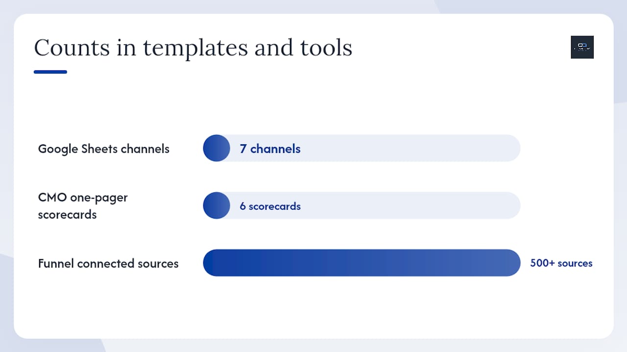
Google Sheets and Microsoft Excel are the right starting point for most teams. A free Google Sheets marketing dashboard template covers seven channels, calculates CTR, CPL, CPC, and ROAS automatically, and shows monthly goals versus actuals. That is enough for a small team to validate metric definitions and data availability before investing in a BI platform. Excel offers the same prototyping speed with stronger pivot table functionality for teams already living in Microsoft 365.
The limitation of spreadsheets is manual data entry. Once your team is refreshing the same cells every Monday morning, the template has done its job and it is time to migrate.
BI and dashboard platforms handle what spreadsheets cannot: automated data refresh, cross-source joins, access controls, and reliable attribution at scale. Here is how the major platforms map to specific needs:
- Geckoboard: Real-time TV dashboards for ops teams. Strong for displaying live metrics on a wall screen in a marketing operations center. Limited in data transformation depth.
- Funnel: Purpose-built for marketing data aggregation. Connects to 500+ marketing data sources and handles the ETL layer before data reaches the visualization tool. Pairs well with Looker Studio or Tableau.
- Preset: Open-source Apache Superset as a managed service. Strong for teams that need SQL-level control over metric definitions and custom chart types. Well-suited to data-mature marketing teams with an analyst on staff.
- Smartsheet: Bridges project management and reporting. Useful for content and campaign teams that need to track deliverables alongside performance metrics in one view.
- monday.com: Similar to Smartsheet in its project-plus-reporting positioning. Better for teams that manage campaign workflows and want KPI tiles embedded in the same workspace.
GA4 and Google Ads function as data sources in this stack, not dashboard engines. Both integrate natively with Looker Studio and through connectors into Funnel, Geckoboard, and Preset. The dashboard engine is a separate layer from the data source.
Template patterns worth bookmarking:
- CMO one-pager: six scorecards (pipeline, ROI, CAC, CLV, MQL volume, MQL-to-SQL rate), one trend chart per metric, monthly cadence
- Channel dashboard: spend vs. budget pacing, CPQL by channel, CTR, conversion rate, weekly refresh
- Email performance view: open rate, CTR, revenue per recipient, list growth, unsubscribe rate, campaign-level breakdown
For e-commerce teams, conversion optimization metrics feed directly into the channel dashboard layer, particularly for ROAS and revenue-per-session tracking.
How to build a marketing dashboard: a step-by-step checklist
Building a dashboard that teams actually use requires getting the sequence right. Most failed dashboards were built in the wrong order: someone built the visualization before confirming the data was clean.
Step 1: Align business questions and KPIs. Write down the three to five questions the dashboard must answer. Map each question to one or two metrics. If a metric does not answer a question on that list, it does not belong on the dashboard.
Step 2: Inventory available data and connectors. List every data source you plan to connect. Confirm the API or connector exists, the data is accessible, and the update frequency matches your reporting cadence.
Step 3: Create canonical metric definitions. Write a one-sentence definition for every metric, including the exact formula, the source system, and any known exclusions. Store this in a shared document or inside the dashboard as a tooltip.
Step 4: Build the ETL/transform layer. This is where raw data becomes dashboard-ready. For spreadsheet dashboards, this is a formula layer. For BI tools, this is a data model or SQL transform. Get this right before building any visualizations.
Step 5: Assemble dashboard views. Build the executive view first (5–7 metrics, scorecard format). Then build the ops view (8–12 metrics, trend charts and breakdowns). Channel views come last.
Step 6: QA and validate. Run the validation checklist from the data sources section. Reconcile at least two weeks of historical data against the source systems before sharing the dashboard with stakeholders.
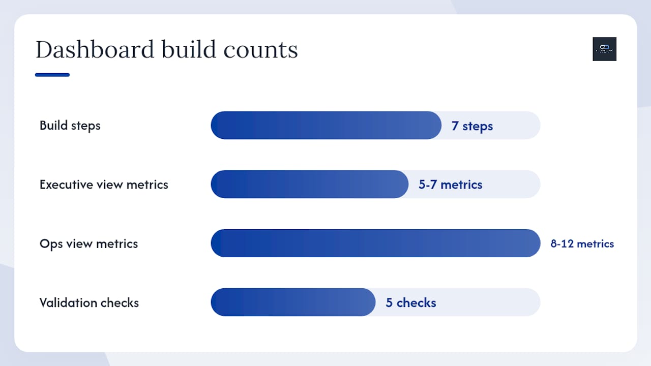
Step 7: Set ownership and cadence. Assign a named owner to every metric. Schedule the first review meeting before the dashboard goes live. A dashboard with no meeting attached to it is a report no one reads.
Validation checklist before launch:
- Revenue figures reconcile with finance within 2% variance
- MQL counts match between marketing automation and CRM
- Attribution model is documented and agreed upon by marketing and sales
- All known data gaps are labeled on the relevant tiles
- Alert thresholds are set for metrics that require immediate action
Rollout approach: Pilot with one team for two weeks. Gather feedback on missing metrics, confusing labels, and data discrepancies. Fix those issues before presenting to leadership. A dashboard that earns trust in the pilot phase scales to the executive layer without resistance.
Benchmarks, targets, and how often to report each KPI
Cadence is not a preference. It is a function of how quickly a metric moves and how fast you can act on it.
| Dashboard Level | Audience | Refresh Cadence | Metric Examples |
|---|---|---|---|
| Channel / operational | Paid managers, SEO, email teams | Daily or real-time | CTR, CPC, spend pacing, open rate |
| Ops / campaign | Marketing ops, campaign managers | Weekly | CPQL, MQL volume, conversion rate, CPL |
| Executive | CMO, VP Marketing, CEO | Monthly or quarterly | Pipeline, CAC, CLV, marketing ROI, LTV:CAC |
Leading indicators (CTR, MQL volume, CPQL) move fast and warrant daily or weekly attention. Lagging indicators (marketing-sourced revenue, CAC trend, LTV:CAC) reflect the cumulative effect of weeks of activity and are most meaningful on a monthly or quarterly view. Checking a lagging indicator daily creates noise, not insight.
For strategic decisions, a 7–14 day data window smooths out day-of-week variation and gives a more reliable signal than a 24-hour snapshot. A single day of low CTR might be a Tuesday. Two weeks of declining CTR is a creative fatigue problem worth acting on.
Benchmark guidance by metric (directional ranges, not hard targets):
- Email open rate: B2B averages vary by industry and list quality; internal benchmarks built from your own historical data are more reliable than cross-industry figures.
- ROAS: A 4:1 ratio is a common floor for paid search in B2B; e-commerce targets often run higher depending on margin structure.
- MQL-to-SQL conversion: Ranges widely by lead definition and sales process; 20–30% is a reasonable starting expectation for a well-aligned sales and marketing team.
- LTV:CAC: A ratio above 3:1 generally indicates a healthy unit economics model; below 1:1 means you are spending more to acquire customers than they return.
Alert threshold rule: Set alerts at a 20–30% deviation from the rolling 30-day average for any metric that requires a same-week response. Tighter thresholds generate alert fatigue. Looser thresholds let problems compound. The 20–30% band gives you signal without noise.
Common dashboard mistakes and how to fix them fast
Most dashboard problems are not data problems. They are design and governance problems that compound over time.
Metric overload. The most common mistake is adding metrics because they are available, not because they are useful. Fix: reduce to 5–7 core KPIs on the primary view. Move everything else to a drilldown or secondary tab.
Inconsistent definitions across tools. “Lead” means something different in your email platform, your CRM, and your ad platform. When those definitions conflict, the dashboard produces arguments, not decisions. Fix: write a canonical definition for every metric and store it in a shared glossary linked from the dashboard.
Mismatched time windows. Comparing a 7-day CTR to a 30-day pipeline figure on the same scorecard row creates a false picture of performance. Fix: enforce a consistent time window per dashboard view. If you need multiple windows, build separate views.
Vanity metrics without action. Total followers, raw page views, and impressions without a conversion context tell you nothing about business impact. Fix: every metric on the dashboard must have a corresponding action: “If this number drops below X, we do Y.”
Missing data lineage. When a number looks wrong, no one knows where it came from. Fix: document the source system, formula, and known exclusions for every metric. Surface that documentation as a tooltip on the tile.
Pro Tip: Assign a metric owner and schedule a quarterly metric audit. The audit has one agenda item: each metric owner answers “What decision did this metric drive in the last 90 days?” Metrics that cannot answer that question get retired or moved to a reference view. This single practice prevents dashboard drift more reliably than any governance policy.
A conversion-focused dashboard checklist for marketing teams
Translating dashboard metrics into conversion outcomes requires connecting the measurement layer to the decision layer. These are the operational steps that close that gap.
Conversion tracking checklist:
- Track ad-to-demo conversion rate by channel and campaign (not just click-to-lead)
- Monitor demo acceptance rate as a leading indicator of pipeline quality
- Report MQL-to-SQL conversion rate weekly to catch lead quality degradation early
- Measure pipeline velocity (average days from MQL to closed-won) to identify bottleneck stages
- Attribute closed-won revenue back to the originating campaign and channel
Operational recommendations:
- A/B test scorecard tile layouts with your ops team. The tile that prompts the fastest correct action wins, regardless of aesthetic preference.
- Add a “recommended action” label to every underperforming tile. If CPQL is 30% above target, the tile should surface the top two campaigns driving that increase, not just the aggregate number.
- Schedule a weekly ops review tied to metric owners. The meeting should last 30 minutes and cover only metrics that deviated more than 20% from the prior week’s baseline.
Pro Tip: Tie dashboard alerts directly to campaign optimization workflows. When ROAS drops below your floor threshold, the alert should trigger a review of the top three spend-weighted campaigns, not a general “performance is down” notification. Specificity in alerts produces faster, more targeted responses.
Pro Tip: Connect budget shift decisions to pipeline velocity data. If a channel’s pipeline velocity is 40% slower than the average, reallocating budget to a faster channel is a data-backed decision, not a gut call. Build that comparison into your weekly ops view so the conversation happens before the quarter closes.
Quantum3’s real-time analytics dashboards are built to surface exactly these conversion signals, connecting ad spend, CRM pipeline, and web behavior into a single view that makes those weekly ops decisions faster and more confident.
What building dashboards in production actually teaches you
The gap between a well-designed dashboard and one that actually changes decisions is almost always a governance gap, not a technology gap. Teams invest weeks in connecting data sources and building beautiful visualizations, then discover that no one agrees on what “MQL” means across the CRM and the marketing automation platform. That definitional conflict surfaces in the first executive review and erodes trust in the entire dashboard.
The most reliable outcome from a production dashboard build is faster budget reallocation. When a team can see CPQL by channel updated weekly rather than reconstructing it from three spreadsheets at month-end, they catch channel efficiency problems four to six weeks earlier. That timing difference is the difference between a budget shift that saves a quarter and a post-mortem that explains why the quarter missed.
The practical constraint most teams underestimate is data model stability. Migrating from a spreadsheet prototype to a BI tool before the metric definitions are locked creates rework. Build in spreadsheets until the definitions are stable and the data sources are confirmed. Then migrate. The prototype phase is not a delay. It is the work.
Quantum3 delivers real-time dashboards built for conversion
Your marketing data is already being collected. The question is whether it is connected, clean, and configured to tell you what to do next.
Quantum3 builds real-time analytics dashboards that pull from your CRM, ad platforms, GA4, and email tools into a single, decision-ready view. The AI integrations layer adds automated alerts and workflow triggers, so a drop in demo acceptance rate or a CPQL spike surfaces as an action item, not a line in a monthly report. Every dashboard Quantum3 delivers includes canonical metric definitions, validated data connections, and a reporting cadence matched to your team’s structure.

For teams that need the full stack, Quantum3 also builds the high-converting pages and funnels that feed the metrics in the first place, closing the loop between measurement and conversion. To discuss your dashboard requirements and get a scoped proposal, contact Quantum3 directly.
Sources
- Dashboard Marketing Metrics: What They Are, How to Track Them, and Why They Matter | Sona
- 15 Essential Marketing KPIs and How to Measure Them
- Marketing Performance Dashboard: 12 Proven, Reliable Metrics
- Marketing Dashboard KPIs: Metrics That Matter in 2026
- Free marketing dashboard template | SpreadsheetPoint
- Marketing dashboard templates | Smartsheet
- Mastering Marketing Analytics with Marketing Dashboards
Recommended
Want this for your business?
Tell us what you have in mind. A quick conversation is all it takes to scope it out.