Insights
Contact Page Optimization: What Actually Drives Conversions

Make your contact page findable, minimal, multi-channel, and measurable, and you capture most of the conversion lift available to you. Shopify’s own guidance points to a short intro, a lean form, a stated response time, and mobile-first layout as the core elements that separate a contact page that converts from one that gets ignored. HubSpot’s research on the topic found that forms with three to five fields consistently outperform longer ones, and one HubSpot study cited in a broader field analysis found three-field forms hitting a 26% conversion rate.
Here’s the one-hour fix: open your current contact form right now and cut every field that isn’t name, email, and message. Everything else can wait.
Key Takeaways
Contact page optimization succeeds when discoverability, minimal fields, multiple channels, visible trust signals, and ongoing testing all work together, not in isolation.
| Point | Details |
|---|---|
| Cut the form to essentials | Keep name, email, and message as defaults; make phone optional and hide extra fields behind conditional logic. |
| Design mobile-first | Use a single column, 44-pixel tap targets, and correct input types like tel and email. |
| State a real response time | Replace vague promises with a specific line like “We reply within one business day.” |
| Track five core events | Measure form start, field abandonment, submit success, time-to-complete, and source attribution. |
| Use Quantum3 for full implementation | Quantum3 builds the audited page, integrates AI voice agents, and routes enquiries into your CRM automatically. |
Table of Contents
- Contact Page Optimization: Fields, Channels, and Routing
- Mobile-First Layout: Findability and Speed
- What Trust Signals Belong Near the Form
- How to Reduce Friction Without Inviting Spam
- Contact Page Optimization: Measuring What Works
- Your 30 to 90 Day Optimization Checklist
- Integration With CRM and Marketing Automation Tools
- Confirmation and Thank-You Page Optimization
- Should You Use Chatbots or AI for First Contact?
- What Most Guides Get Wrong About Contact Pages
- How Quantum3 Turns This Checklist Into a Working Page
- Sources
Contact Page Optimization: Fields, Channels, and Routing
Three fields do the heavy lifting: name, email, and message. Phone should be optional unless you run a business where a callback genuinely speeds things up, like home services or B2B sales. Anything beyond that, an order number, a preferred appointment time, a product SKU, belongs behind a conditional trigger, not on the default view.
Show it only when the visitor’s answer to an earlier question makes it relevant. Someone selecting “billing issue” from a dropdown should see an order number field appear. Someone selecting “general inquiry” never should.
Channel presentation matters as much as field count. The Nielsen Norman Group has found that visitors still expect to see a phone number, a physical address, and an email address on contact pages, even when a form is the primary path. Don’t strip these out in favor of chat or forms alone; layer them.
- Small business: name, email, message, optional phone. Add a simple inquiry-type dropdown if you handle more than two categories of requests.
- Enterprise or multi-department sites: add a department selector (sales, support, billing) so routing happens automatically instead of through a generic inbox.
- Service businesses: click-to-call should sit above the fold; a form alone undersells urgency.
Pro Tip: Label your dropdown options by intent, not internal team names. “Get a quote” converts better than “Sales team,” because the visitor is choosing an outcome, not a department.
Mobile-First Layout: Findability and Speed
Most contact page traffic now arrives on a phone, and a two-column form built for desktop breaks the moment it hits a five-inch screen. Stack every field in a single column, set tap targets at a minimum of 44 pixels, and use the right input type for each field, type="tel" for phone, type="email" for email, so the correct keyboard appears automatically.

Discoverability is a separate problem from layout. A contact link buried three clicks deep loses visitors before they ever see your form. Put it in the header and footer of every page, and add a direct CTA on high-intent pages like pricing or product detail pages, where someone is already close to a decision.
Speed compounds everything else. The Alphonso Labs checklist for high-converting contact pages sets page load under three seconds as a baseline requirement, and a form that takes that long to appear loses visitors before they type a single letter.
- Lazy-load any embedded map so it doesn’t block the initial render.
- Defer third-party scripts (chat widgets, tracking pixels) until after the core page loads.
- Compress hero images; a contact page rarely needs a large photograph above the form.
What Trust Signals Belong Near the Form
A visitor filling out a form is making a small leap of faith. Reduce that leap with specifics, not vague reassurance. State a real response time, “We reply within one business day,” not “We’ll get back to you soon.” Specificity reads as honesty.
Human elements do real work here. A named contact with a role label (“Sarah, Customer Success”) and a genuine team photo signal that a real person reads these submissions, not a queue that disappears into a void. Stock photography undercuts this instantly; visitors can tell the difference.
- State your response time in one short sentence, placed directly above or beside the form.
- Show a real name, face, and role for at least one point of contact.
- Add a plain-English line on data use (“We only use this to respond to your message”) with a link to your full privacy policy.
Skipping the privacy line doesn’t just cost trust. It can violate consent requirements depending on what you collect and where your visitors are located.
How to Reduce Friction Without Inviting Spam
Inline validation catches mistakes as they happen instead of after submission. A red border and a plain sentence (“Please enter a valid email”) beside the field beats a generic error banner at the top of the page that forces the visitor to hunt for what went wrong.
Multi-step forms let you keep the first screen short while still collecting qualifying details later. Ask for name and email first; only ask for project budget or timeline once the visitor has committed to step one. Simplifying the initial ask this way, sometimes called progressive disclosure, tends to raise completion rates because the first screen never feels like a chore.
Spam protection should be invisible whenever possible. Invisible reCAPTCHA, server-side field checks, and time-based heuristics (a form submitted in under two seconds is almost certainly a bot) catch most junk without forcing a human to solve a puzzle. Always keep an accessible fallback for visitors using screen readers or older browsers.
Contact Page Optimization: Measuring What Works
Guesswork is the enemy here. You need five events tracked before you can call anything optimized: form start, field-level abandonment, successful submit, time-to-complete, and source attribution (which page or channel sent the visitor).
Run tests in this order:
- Field count first. Cut one field and measure the completion-rate change over two weeks.
- CTA copy second. “Get your free quote” against “Send message” often produces a measurable gap.
- Form placement third. Above the fold against below an intro paragraph.
- Button color and label last. Smaller impact, but worth confirming once the bigger levers are set.
Quick wins deserve a two to four week test window, long enough to see a real pattern without stalling your roadmap. Beyond that, run a quarterly audit of the whole page. Repeated small tests on CTA copy, field count, and placement tend to produce the largest sustainable gains over a year, more than any single redesign.
Your 30 to 90 Day Optimization Checklist
You don’t need a full rebuild to see gains. Sequence the work by effort and payoff.
- Days 1 to 7: Rewrite your CTA button copy, make your phone number a clickable
tel:link, add a response-time statement above the form, and fix any tap targets under 44 pixels. - Weeks 2 to 4: Cut your form down to three to five fields, add inline validation with clear error text, and lazy-load any map or video embed that isn’t essential to the page.
- Months 2 to 3: Launch your first A/B test (start with field count or CTA copy), wire up the five core analytics events, and put a recurring quarterly audit on the calendar.
Each phase builds on the last. Skipping straight to A/B testing before your form is even mobile-friendly wastes the test, because you’re optimizing a page that’s still losing visitors to basic friction.
Integration With CRM and Marketing Automation Tools
A contact form that doesn’t talk to your CRM creates manual work and lets leads go cold while someone copies data from an inbox into a spreadsheet. Every submission should land directly in your CRM, tagged by inquiry type and source, the moment the visitor hits submit.
This is where department routing pays off twice. A dropdown that separates “sales” from “support” doesn’t just help the visitor. It lets your automation assign the lead to the right pipeline stage and trigger the right follow-up sequence automatically, a quote request gets a sales rep and a scheduling link, a support question gets ticketed and acknowledged.
Marketing automation tools can also score leads based on which page they came from and what they typed. A message that mentions “enterprise” or “bulk order” can trigger a higher-priority flag than a general question, without anyone manually reviewing every submission first.
The technical setup matters too. Server-side form handling, rather than relying purely on client-side JavaScript, reduces the chance that ad blockers or browser privacy settings silently drop your submission data before it ever reaches your CRM. If you’re already tracking conversions, pairing your form with a server-side tracking approach closes measurement gaps that client-side tags routinely miss, so your reported conversion numbers match what actually happened.
Get this integration wrong and you’ll see phantom drop-off in your analytics, visitors who submitted a form but never show up as a lead because the data never made it past your website.
Confirmation and Thank-You Page Optimization
The thank-you page is the most underused real estate on most websites. A visitor who just submitted a form is at peak engagement, and a generic “Thanks, we’ll be in touch” wastes that moment entirely.
Confirm the specific action taken. Restate the response-time promise you made near the form (“We’ll reply within one business day”) so the visitor isn’t left wondering whether the submission actually worked. Uncertainty here drives duplicate submissions, which clutters your CRM with repeat entries from the same person.
Give the visitor something to do while they wait. A link to your FAQ page, a case study, or a short explainer video keeps them engaged with your brand instead of immediately closing the tab. This also reduces support load, because a well-placed FAQ answers questions that would otherwise arrive as a second, redundant message.
Track the thank-you page as its own event. If your form-submit event fires but visitors rarely reach the thank-you page, you likely have a technical redirect issue losing conversions your analytics never catch. This page is also a natural spot to invite a next step: a newsletter signup, a calendar booking link, or a product demo. A short product demo video embedded here can turn a simple confirmation into a second conversion opportunity, especially for visitors who submitted a general inquiry rather than a specific request.
Don’t bury this page behind a redirect chain that slows the confirmation. Keep it fast, specific, and useful.
Should You Use Chatbots or AI for First Contact?
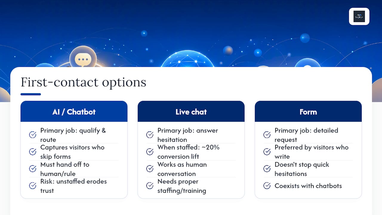
A chatbot or AI voice agent works well for exactly one job at first contact: qualifying and routing, not replacing a human conversation entirely. Live chat, when properly staffed, has been shown to raise conversion by roughly 20% in some surveys, because it answers the hesitation that stops someone from filling out a form in the first place.
The catch is that an unstaffed or poorly trained chat widget does the opposite. A bot that can’t answer a basic pricing question, or one that loops a visitor through the same three menu options, erodes the trust you just built with your response-time statement. If you’re going to add AI to your contact flow, it needs to handle real qualification, gathering the visitor’s intent, urgency, and basic details, and then hand off cleanly to a human or a routing rule, not just deflect.
Voice agents extend this further for businesses that get a meaningful volume of phone inquiries. An AI voice agent can answer common questions, book an appointment directly into a calendar, or route an urgent call to the right person, all without a visitor sitting on hold. This matters most for businesses like home services, clinics, or local retailers, where phone remains the highest-intent channel despite everyone’s focus on forms.
The mistake most sites make is treating chatbots and forms as competing channels. They’re not. A chatbot can capture a visitor who wouldn’t have filled out a form at all, while your form still handles the visitors who prefer to write out a detailed request. Offer both, and let the visitor’s own behavior decide which one they use.
What Most Guides Get Wrong About Contact Pages
Most contact page advice treats the page like a static brochure: list your details, add a form, done. That framing misses the point. A contact page is the last conversion event on your site, the moment a visitor decides whether the effort of reaching you is worth it, and every unnecessary field or vague promise adds friction right at that decision point.
The bigger blind spot is treating chat, phone, and form as competing options instead of a layered system. Quantum3 has watched clients agonize over which single channel to “pick,” when the real answer is almost always to route by intent and let analytics tell you which channel actually earns its place over time. Trevor has spent years watching businesses obsess over design polish while ignoring the response-time gap between what a page promises and what actually happens after submit,. That gap is where most trust erodes, not in the visual layout.
How Quantum3 Turns This Checklist Into a Working Page
Reading a checklist and implementing it under a deadline are different problems. Quantum3 built its Pages And Funnels service specifically to take a page like this one from audit to live in days, not months, with the field logic, mobile layout, and speed fixes built in from the first draft rather than patched on afterward.
For businesses that get high call volume, Quantum3’s AI voice agent integrations handle qualification and appointment booking around the clock, so a missed call stops meaning a missed lead. And once submissions start flowing, Enquiries routing tags and sends each one to the right pipeline stage automatically, no manual sorting required.
A quick audit engagement typically covers three deliverables: the five analytics events set up and firing correctly, a prioritized A/B test plan based on your current traffic, and an updated page built to the mobile-first, minimal-field standard outlined above. If your contact page hasn’t been touched in over a year, that’s the fastest way to find out exactly what it’s costing you. Visit the Pages And Funnels page to see the build process, or request a free audit to get a baseline before you change anything.
Sources
- ‘Contact Us’ Page Guidelines - NN/G
- 12 Contact Page Requirements for High Conversions 2026
- Best contact us pages - HubSpot
Recommended
Want this for your business?
Tell us what you have in mind. A quick conversation is all it takes to scope it out.