Insights
Checkout Optimization: Your 2026 Conversion Playbook

The five changes that recover the most lost carts right now are: enable guest checkout, cut your form to 7–8 fields, surface the full price (shipping, taxes, fees) in the cart before checkout, add at least one digital wallet (Apple Pay or Google Pay), and measure step-level drop-off in GA4 so you know exactly where shoppers leave. Stripe’s checkout best-practices research confirms that unexpected costs, forced account creation, and checkout complexity are the top three abandonment drivers. Fix those first.
Your 7-day action list:
- Enable guest checkout and move account creation to the post-purchase confirmation page
- Audit your form fields and remove every non-essential input (target: 7–8 visible fields)
- Add a shipping and tax estimator to the cart page so the total is never a surprise
- Activate Apple Pay and Google Pay through your payment gateway
- Set up GA4 checkout funnel events to capture step-level drop-off data
Key Takeaways
Checkout optimization delivers the fastest measurable conversion gains when you fix the highest-leak steps first, guided by real funnel data rather than generic best-practice lists.
| Point | Details |
|---|---|
| Fix the top three abandonment drivers first | Unexpected costs, forced account creation, and checkout complexity cause the most drop-off; address these before anything else. |
| Cut form fields to 7–8 | Reducing visible fields from the industry average to 7–8, with address autocomplete, cuts input errors and friction measurably. |
| Add digital wallets immediately | Apple Pay and Google Pay are the highest-converting payment option for mobile shoppers and activate through your existing gateway. |
| Run the one-hour audit before coding | Funnel mapping and a mobile walkthrough identify your specific highest-leak step faster than any generic checklist. |
| Quantum3 executes the full plan | Quantum3 delivers checkout audits, payment integration, GA4 instrumentation, and 90-day monitoring as a complete engagement. |
Table of Contents
- What is checkout optimization and why does it drive conversion?
- How to fix your cart page before shoppers reach checkout
- Which form fields should you keep, and how should you design them?
- Which payment methods should you offer, and in what order?
- How do trust signals and page speed affect checkout completion?
- How do you handle errors, declines, and fraud without losing the sale?
- How do you recover abandoned carts and measure what is working?
- Your one-hour checkout audit and 30/60/90 rollout plan
- Does your checkout work for every shopper?
- How personalization and dynamic elements speed up repeat purchases
- How to handle coupon codes without breaking your checkout flow
- What to do after the order is placed
- The part most guides get wrong about checkout fixes
- Quantum3 builds and fixes checkout flows that convert
- Sources
What is checkout optimization and why does it drive conversion?
Checkout optimization is the practice of removing every unnecessary barrier between a shopper’s intent to buy and a completed order. The goal is a single metric: checkout completion rate. Baymard’s checkout UX research documents that design and usability improvements, applied correctly, produce substantial conversion uplifts across hundreds of tested ecommerce sites. Guest checkout, visible totals, and inline validation consistently appear at the top of their must-have list.
The guiding philosophy is ruthless elimination of necessity. Kissmetrics’ analysis of Amazon’s checkout evolution shows what that looks like in practice: Amazon reduced a seven-step checkout to two, then to one click, and revenue followed. Every field, step, or upsell you keep must justify its presence. If it cannot, move it post-purchase or remove it entirely.
Core principles to apply to every checkout decision:
- Minimize interaction cost: fewer taps, fewer fields, fewer decisions
- Predictable flow: shoppers should never be surprised by a new screen or a hidden fee
- Visible total cost: show shipping, taxes, and fees before the payment step
- Payment flexibility: cards, wallets, and at least one buy-now-pay-later option
- Fast mobile experience: wallet buttons, large tap targets, and no layout shifts
How to fix your cart page before shoppers reach checkout
The cart page is where buying intent is either preserved or lost. Its job is to remove surprises and give shoppers a fast path forward. Stripe’s checkout screen guidance is direct: unexpected costs at checkout are the single most common abandonment trigger, which means the cart must show the real total before the shopper clicks “Proceed.”
Practical cart-level fixes to implement now:
- Add a shipping and tax estimator widget so the final price is visible in the cart
- Display a free-shipping threshold progress bar (“Add $12 more for free shipping”)
- Surface your return and refund policy as a one-line link near the order total
- Enable save-for-later and persistent cart so returning visitors pick up where they left off
- Render express checkout buttons (Apple Pay, Google Pay, PayPal) directly on the cart page and product detail pages, not only on the checkout page
Pro Tip: You do not need a complex tax engine to show estimates. A flat-rate shipping rule or a zip-code-based estimator covers the majority of US shoppers and eliminates the “surprise” moment that kills conversions.
Which form fields should you keep, and how should you design them?
Fewer fields plus smart defaults produce an immediate lift in completion rates. Baymard’s current-state checkout research shows that the average ecommerce checkout asks for 14–19 form fields, while the practical minimum is closer to 7–8. That gap is where conversions disappear.
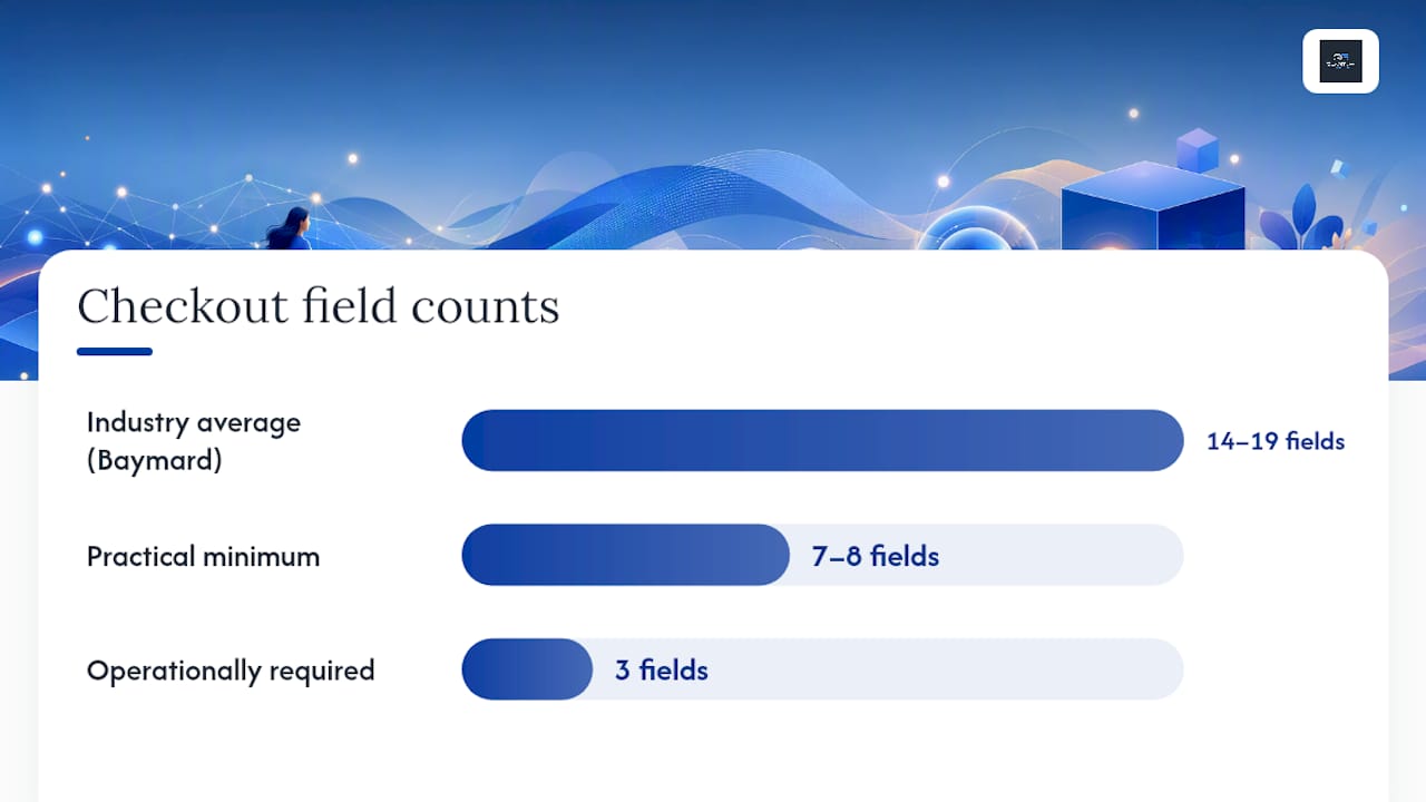
Keep only what is operationally required: email address, shipping address (with address autocomplete via Google Places), and payment details. Defer or hide business name, delivery notes, and marketing opt-in checkboxes. Move the newsletter checkbox to the order confirmation page, where it converts better anyway.
Design tactics that reduce errors and drop-off:
- Use a single-column layout so the eye never has to scan horizontally
- Place labels above fields, not inside them, so they stay visible while typing
- Trigger inline validation on blur (when the user leaves a field), not on submit
- Enable browser autofill by using standard HTML
autocompleteattribute values - Offer save-card tokenization for returning customers through your gateway (Stripe, for example, handles this natively)
- Add a short justification next to sensitive fields: “Phone number — for courier delivery updates only” reduces anxiety and increases completion
Stripe’s UI design guidance reinforces the same pattern: minimal fields, a persistent order summary visible throughout, and a clear CTA button are the three highest-impact UI decisions.
Stat to know: Reducing visible form fields from the industry average to 7–8 fields, combined with address autocomplete, significantly cuts input errors and friction according to Baymard’s field-count research.
Pro Tip: To A/B test removing a field safely, run the variant for at least two full business weeks, use completion rate and error rate as your primary metrics, and set a guardrail on order error rate (returns, failed deliveries) to confirm the removed field was not operationally necessary.
Which payment methods should you offer, and in what order?
Start with cards plus at least one digital wallet, then layer in PayPal and buy-now-pay-later options based on your audience and average order value. Stripe’s localization research shows that surfacing regionally preferred wallets and BNPL options can materially lift conversion for target audiences.
Implementation order and what each method does best:
- Stripe (gateway): handles card processing, fraud detection, and wallet activation in one integration; the logical starting point for most US merchants
- Apple Pay and Google Pay: one-tap checkout on mobile; no card number entry, no redirect; highest-converting option for mobile shoppers and the first wallet to activate
- PayPal: trusted by a large share of US shoppers, especially for first-time purchases from unfamiliar stores; adds credibility and a familiar safety net
- Shop Pay: Shopify’s accelerated checkout; pre-fills address and payment for returning Shopify network customers; strong for Shopify merchants targeting repeat buyers
- Klarna and Affirm: BNPL options that split the total into installments; most effective for AOVs above $100 where the monthly payment framing reduces sticker shock
UI rules for payment presentation:
- On mobile, render wallet buttons (Apple Pay, Google Pay) above the card form, not below it
- Preselect the most likely payment method based on device type (wallet on mobile, card on desktop)
- If a method redirects to an external page (PayPal), display a brief “You’ll be redirected to PayPal to complete your payment” message to prevent confusion
- Test each method end-to-end in a staging environment before going live, including decline and cancellation flows
How do trust signals and page speed affect checkout completion?
Trust and speed are non-negotiable at the payment step. A shopper who hesitates at the “Pay Now” button needs two things simultaneously: confidence that the transaction is secure and a page that responds fast enough to keep them from second-guessing. Baymard’s UX research identifies last-click hesitation as a real conversion killer, and transparent totals, security signals, and visible support contacts are the primary antidotes.
Trust signals to place near your CTA:
- SSL padlock and “Secure Checkout” label in the page header
- Payment method logos (Visa, Mastercard, PayPal, Apple Pay) directly below the pay button
- Estimated delivery date (“Arrives by Thursday, July 10”) rather than a vague shipping window
- A one-line return policy link (“Free 30-day returns”) near the order total
- A visible help option: live chat widget, toll-free number, or “Questions? Email us” link
Performance actions that directly reduce abandonment:
- Remove non-essential third-party scripts (marketing pixels, heatmap tools) from the checkout page; defer them to fire after order confirmation instead
- Lazy-load non-critical assets (footer images, chat widget scripts) so the payment form renders first
- Measure Time to First Byte (TTFB) and Largest Contentful Paint (LCP) specifically for your checkout URL, not just your homepage
Stripe’s performance guidance is explicit: removing non-essential tags from checkout pages has an outsized impact on load speed and, by extension, completion rates.
Pro Tip: Trust badges work best when they are small, grouped, and placed near the pay button. A cluttered row of eight logos reads as anxiety rather than reassurance. Pick three to four that your audience recognizes and leave the rest out.
How do you handle errors, declines, and fraud without losing the sale?
Clear, recoverable, and immediate error messages prevent the abandonment that vague or delayed feedback causes. Most checkout drop-off at the payment step is not fraud; it is a mistyped card number or an expired card that a well-designed error state would have recovered.
Error and decline best practices:
- Show inline validation errors on the specific field that failed, not a generic top-of-form banner
- Preserve all previously entered data when an error occurs; never clear the form on a failed payment
- For declines, display a plain-language message: “Your card was declined. Please check your card number and expiry date, or try a different payment method.” Avoid technical codes.
- Offer an alternative payment method immediately after a decline (a wallet button or PayPal link)
- Limit retry guidance to two attempts before suggesting a different method, to avoid card lockouts
Stat to know: Payment gateway dashboards typically flag authorization rates below 85% as a signal worth investigating; a sudden drop in your gateway’s success rate often points to a fraud rule that is too aggressive rather than actual fraud.
On fraud settings: start with your gateway’s default rules (Stripe Radar’s defaults are well-calibrated for US merchants), then tighten only after reviewing your decline-rate data. Overly aggressive fraud rules reject legitimate customers and are a silent conversion killer. Instrument success and failure events in your gateway dashboard from day one so you have a baseline before making any rule changes.
How do you recover abandoned carts and measure what is working?
Recoveries and measurement together turn lost carts into revenue and learning. Without step-level funnel data, you are guessing which fix to prioritize. Without a recovery sequence, you are leaving recoverable revenue on the table.
Funnel instrumentation in GA4:
- Define each checkout step as a GA4 event:
begin_checkout,add_shipping_info,add_payment_info,purchase - Build a funnel exploration report in GA4 to see the percentage of users who drop off at each step
- Add session recording (Microsoft Clarity is free) to watch real drop-off moments
- Review the user journey mapping guide for a structured approach to mapping funnel steps before you instrument them
Abandoned-cart recovery sequence:
- Email within 60 minutes of abandonment: show the cart contents, include a direct link back, and keep the copy short
- SMS follow-up at 24 hours (only for consented subscribers): one sentence, one link, no discount yet
- Third touch at 48–72 hours with a time-limited incentive (free shipping or 10% off): this is where the discount belongs, not in the first email, which trains shoppers to abandon intentionally
Onlinestorenews’ 2026 cart abandonment guide recommends this staged sequence specifically to avoid conditioning shoppers to expect an automatic discount.
A/B test cadence and guardrail metrics:
See the ecommerce conversion optimization guide for A/B test design principles that apply directly to checkout.
Your one-hour checkout audit and 30/60/90 rollout plan
Run this audit now, then follow the 30/60/90 plan to execute fixes in priority order. Onlinestorenews’ audit-first approach confirms that mapping the funnel and doing a mobile walkthrough before writing a single line of code consistently surfaces the highest-leak steps.
One-hour audit checklist:
- Walk through checkout on a real mobile device (not a browser emulator) and note every friction point
- Open GA4 and build a funnel report; identify the step with the highest drop-off percentage
- Count your visible form fields; flag any field that is not operationally required
- Confirm guest checkout is available and does not require a password at any point
- Check that shipping cost and taxes are visible before the payment step
- Run your checkout URL through Google PageSpeed Insights and note LCP and TTFB scores
- Open your browser’s Network tab and count third-party scripts loading on the checkout page
30/60/90 rollout plan:
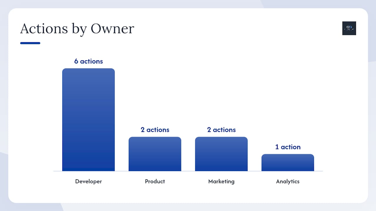
| Timeline | Priority | Action | Owner |
|---|---|---|---|
| Days 1–30 | Quick wins | Enable guest checkout, cut fields to 7–8, add shipping estimator to cart | Product / Marketing |
| Days 1–30 | Quick wins | Activate Apple Pay and Google Pay via gateway | Developer |
| Days 1–30 | Quick wins | Set up GA4 funnel events and session recording | Developer / Analytics |
| Days 30–60 | Medium work | Build 3-step abandoned-cart email + SMS sequence | Marketing |
| Days 30–60 | Medium work | Add inline validation and address autocomplete | Developer |
| Days 30–60 | Medium work | Remove non-essential scripts from checkout page | Developer |
| Days 60–90 | Platform / Engineering | Add BNPL (Klarna or Affirm) and test end-to-end | Developer |
| Days 60–90 | Platform / Engineering | Run first A/B test (guest checkout or field reduction) | Product |
| Days 60–90 | Platform / Engineering | Implement server-side tracking for checkout events | Developer |
Pro Tip: Before presenting checkout changes to stakeholders, version-control your checkout template in Git and document the baseline conversion rate. A single screenshot of the “before” funnel report is worth more than any slide deck when you need to demonstrate impact three months later.
Does your checkout work for every shopper?
Accessibility at checkout is not a compliance checkbox; it is a revenue issue. Shoppers using screen readers, keyboard navigation, or voice control abandon at higher rates when form fields lack proper labels, error messages are not announced, or interactive elements cannot be reached without a mouse.
Minimum requirements for an accessible checkout:
- Every form field must have a visible
<label>element associated viafor/idattributes, not just a placeholder - Error messages must be programmatically associated with the field that failed (use
aria-describedby) so screen readers announce them - All interactive elements (buttons, links, dropdowns) must be reachable and operable via keyboard Tab and Enter
- Color contrast for text and CTA buttons must meet WCAG 2.1 AA (4.5:1 ratio for normal text)
- Touch targets on mobile must be at least 44x44 pixels to accommodate motor impairments
Running your checkout through the free WAVE accessibility tool takes under five minutes and flags the most common violations. Fixing label associations and contrast issues alone typically resolves the majority of automated errors.
How personalization and dynamic elements speed up repeat purchases
Returning customers should never have to re-enter information they gave you before. Personalization at checkout is less about product recommendations and more about reducing friction for known users.
The highest-impact dynamic elements are saved addresses and saved payment methods. When a returning customer lands on checkout and sees their shipping address and card already populated, the cognitive load drops to near zero. Stripe’s tokenization handles saved cards securely without storing raw card data on your servers. For addresses, a simple “Use saved address?” prompt with a one-click confirm is enough.
For first-time visitors, dynamic elements that help include: auto-detecting country from IP to pre-select the shipping country, showing the most relevant payment methods based on device type (wallet on iOS, Google Pay on Android), and pre-filling the email field for shoppers who arrived from a logged-in email campaign link. None of these require a sophisticated personalization engine; they are standard gateway and platform features available on Shopify, WooCommerce, and most custom builds.
How to handle coupon codes without breaking your checkout flow
A coupon code field that is always visible creates a problem: shoppers without a code see it, leave to search for one, and often do not come back. The fix is straightforward: collapse the coupon field behind a “Have a promo code?” link so it is available but not prominent.
A few additional rules that prevent coupon-related drop-off:
- Validate the code inline and show the discount applied to the order total immediately, before the shopper clicks “Place Order”
- Display a clear error message if the code is expired or does not apply (“This code is for new customers only”), not a generic “Invalid code”
- If a discount is already applied automatically (from a campaign link), hide the coupon field entirely to avoid confusion
- Never remove the coupon field on mobile to save space; collapsing it is enough
The goal is to make the discount feel like a reward, not a puzzle. A shopper who successfully applies a code and sees the total drop is more committed to completing the purchase, not less.
What to do after the order is placed
The order confirmation page and the post-purchase email sequence are the most underused conversion surfaces in ecommerce. The shopper is at peak trust: they just gave you their money and their address. That is the right moment for account creation prompts, upsells, and cross-sells, not the checkout page.
Effective post-purchase tactics:
- Account creation prompt on the confirmation page: “Save your details for faster checkout next time” converts well because the value is obvious and immediate
- Order bump or upsell on the confirmation page: a single, relevant add-on at a reduced price (a complementary product, an extended warranty, a subscription upgrade) works because the payment friction is already gone
- Cross-sell in the confirmation email: show two or three related products with a “Complete the look” or “Customers also bought” framing; keep the email focused on order details first, cross-sell second
- SMS or email at delivery: a “Your order arrived” message with a review request and a “Shop again” link drives repeat purchase at the moment satisfaction is highest
For post-purchase content strategy, the principle is the same as checkout: every element must earn its place. One well-timed upsell outperforms a cluttered confirmation page every time.
The part most guides get wrong about checkout fixes
Most checkout optimization content treats every store the same. The reality is that the right priority depends on your business model, your average order value, and where your funnel is actually leaking.
A high-AOV store selling $300+ products should prioritize BNPL (Klarna, Affirm) and trust signals before worrying about field count. A low-AOV store with high mobile traffic should fix wallet button placement and page speed before anything else. A B2B store with repeat buyers should invest in saved addresses, saved cards, and a streamlined reorder flow rather than guest checkout.
The audit checklist in this guide exists precisely because the data tells you which fix matters most for your store. Running the one-hour audit before writing a single line of code is not a delay; it is the fastest path to a measurable result. Merchants who skip the audit and implement every fix at once end up with no clean signal on what actually moved the needle.
My honest recommendation: do the audit, pick the two highest-leak steps, fix those first, and measure for two weeks before moving to the next item on the 30/60/90 plan. That discipline compounds. Stores that test one change at a time build a conversion knowledge base that becomes a durable competitive advantage.
Quantum3 builds and fixes checkout flows that convert
Checkout audits, payment integration, and analytics wiring are exactly where Quantum3 delivers measurable results fast. Rather than handing you a report and walking away, Quantum3 works through the full 30/60/90 plan with your team: from the one-hour audit to prioritized fixes, GA4 funnel instrumentation, payment gateway integration (Stripe, Apple Pay, Google Pay, BNPL), and post-launch monitoring.
A typical engagement includes a documented checkout audit, a prioritized fix list with developer-ready specs, QA on every payment method, and a 90-day performance review. For stores that want to go further, AI integrations can automate abandoned-cart recovery sequences and intelligent checkout support, reducing manual follow-up without adding headcount.
If you are ready to stop guessing which fix matters most, request a checkout audit and get a prioritized plan built around your store’s actual funnel data.
Sources
The following resources were used to build this guide and are worth bookmarking for deeper implementation detail:
- Checkout Optimization: How Amazon Went from 7 Steps to 2
- How to reduce cart abandonment at checkout in 2026
- Checkout screen best practices for high conversion | Stripe
Recommended
Want this for your business?
Tell us what you have in mind. A quick conversation is all it takes to scope it out.